This dashboard provides an in-depth analysis of world climate data, featuring the following key insights:
- World map visualization showcasing temperature changes from 1975 to present, highlighting trends and variations across countries.
- Top 10 countries with the maximum and Minimum temperature change in previous years.
- Interactive line graphs with filtering options to display temperature trends for specific countries, enabling detailed exploration and comparison.
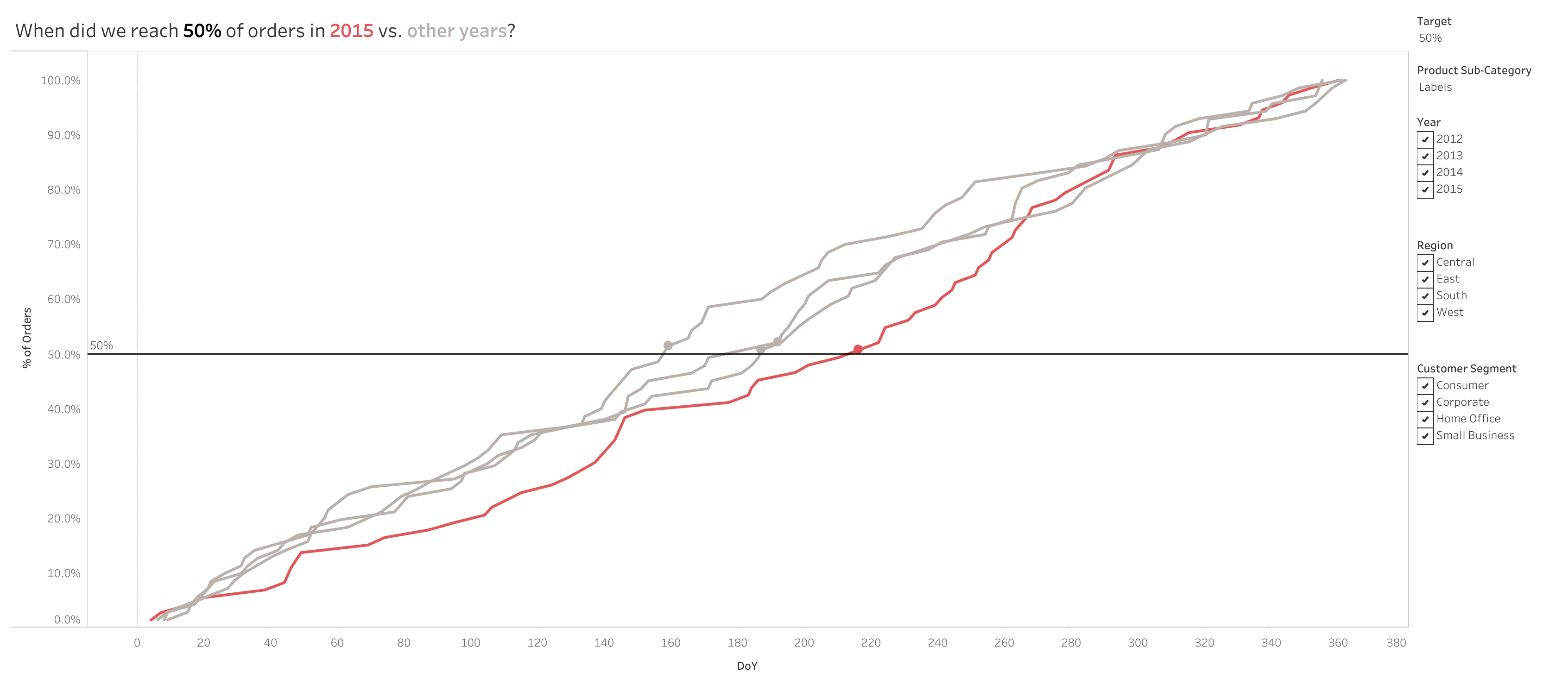
This dashboard focuses on analyzing purchase frequencies using dynamic parameters and visualization techniques:
- Filtering the dashboard using a parameter.
- Dynamically adjusting the reference line to highlight the minimum day where the total percentage of orders exceeds the target parameter value.
- Synchronizing a dual-axis chart—one displaying a line graph and the other a circle graph—centered on the minimum day above the target parameter.
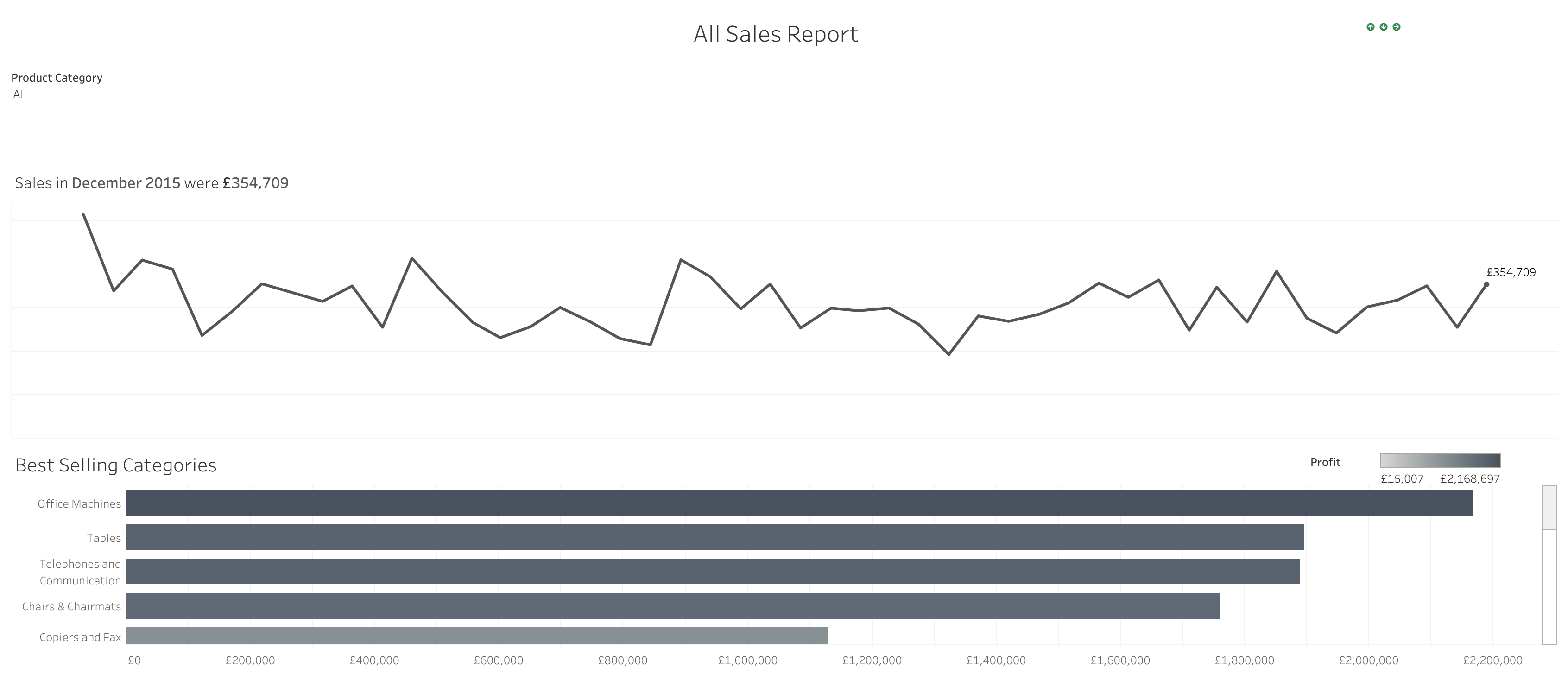
This dashboard explores department sales trends with dynamic interactivity using filters and visualization techniques:
- Implementing dynamic title and logo switching for a more engaging experience.
- Creating clear and informative titles to enhance data comprehension.
- Applying logic to hide visual elements when “All” is selected, ensuring a cleaner display.
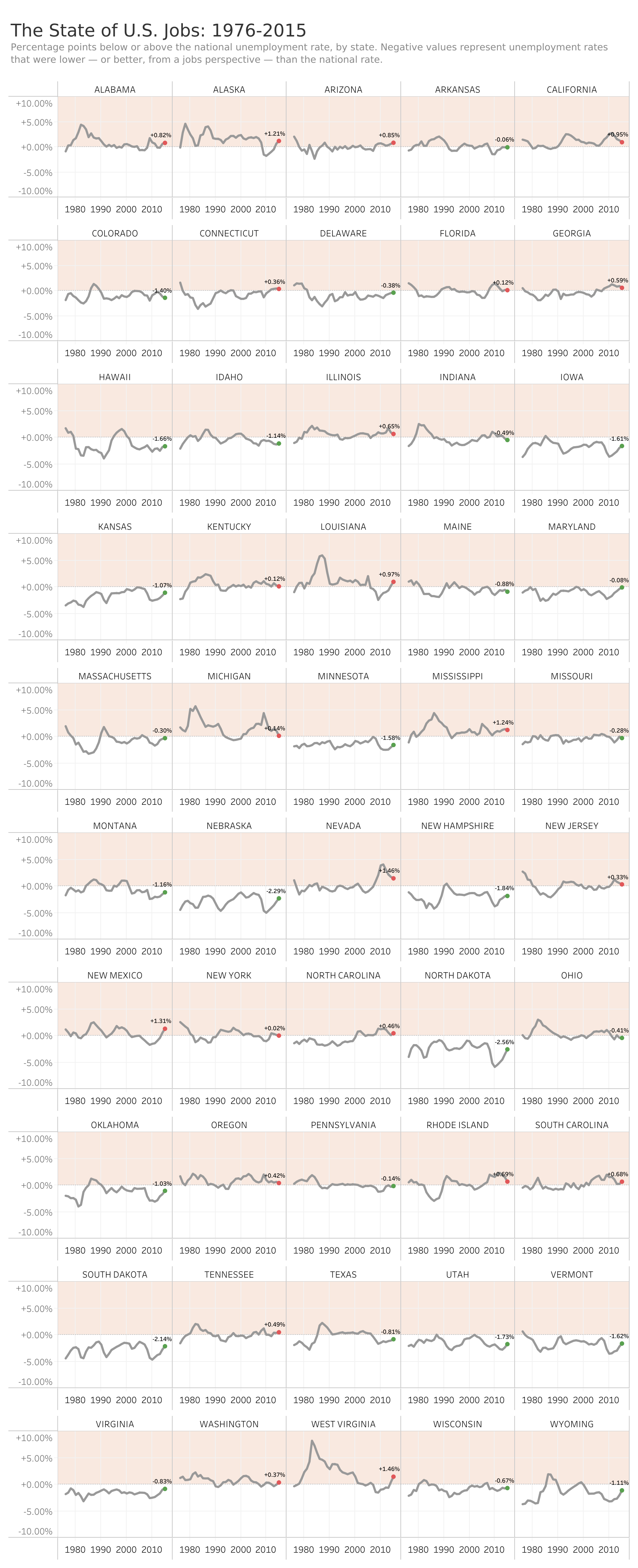
This dashboard presents the state of U.S. jobs across all states in comparison to the national average, highlighting the percentage :
- Adjusting tile sizes for optimal dashboard layout.
- Becoming proficient in synchronizing dual axes and creating calculated fields, as well as formatting positive and negative numbers with proper symbols.
- Adding labels only for the minimum and maximum values to enhance clarity and focus.
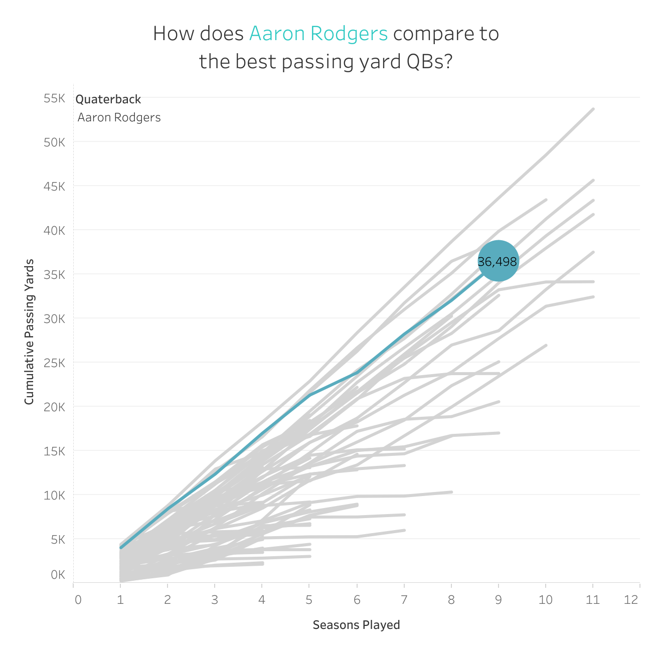
This dashboard visualizes the total passing yards of quarterbacks across multiple seasons, showcasing the running total of passing yards for each player:
- Using a common baseline for all players to allow for accurate comparison.
- Displaying the total yards inside the circle graph for better clarity.
- Highlighting the line of the selected player to emphasize their performance.